Client
Bonfire
Role
Product designer
Services
Design system
Accessibility
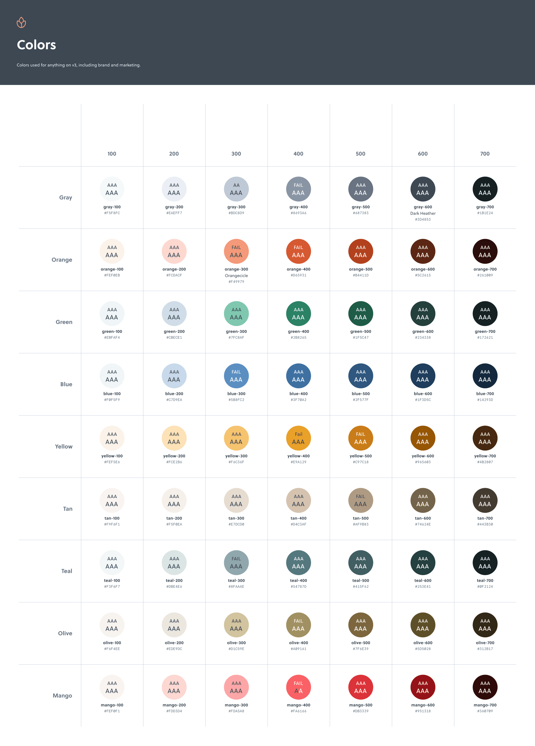
An accessible colour palette
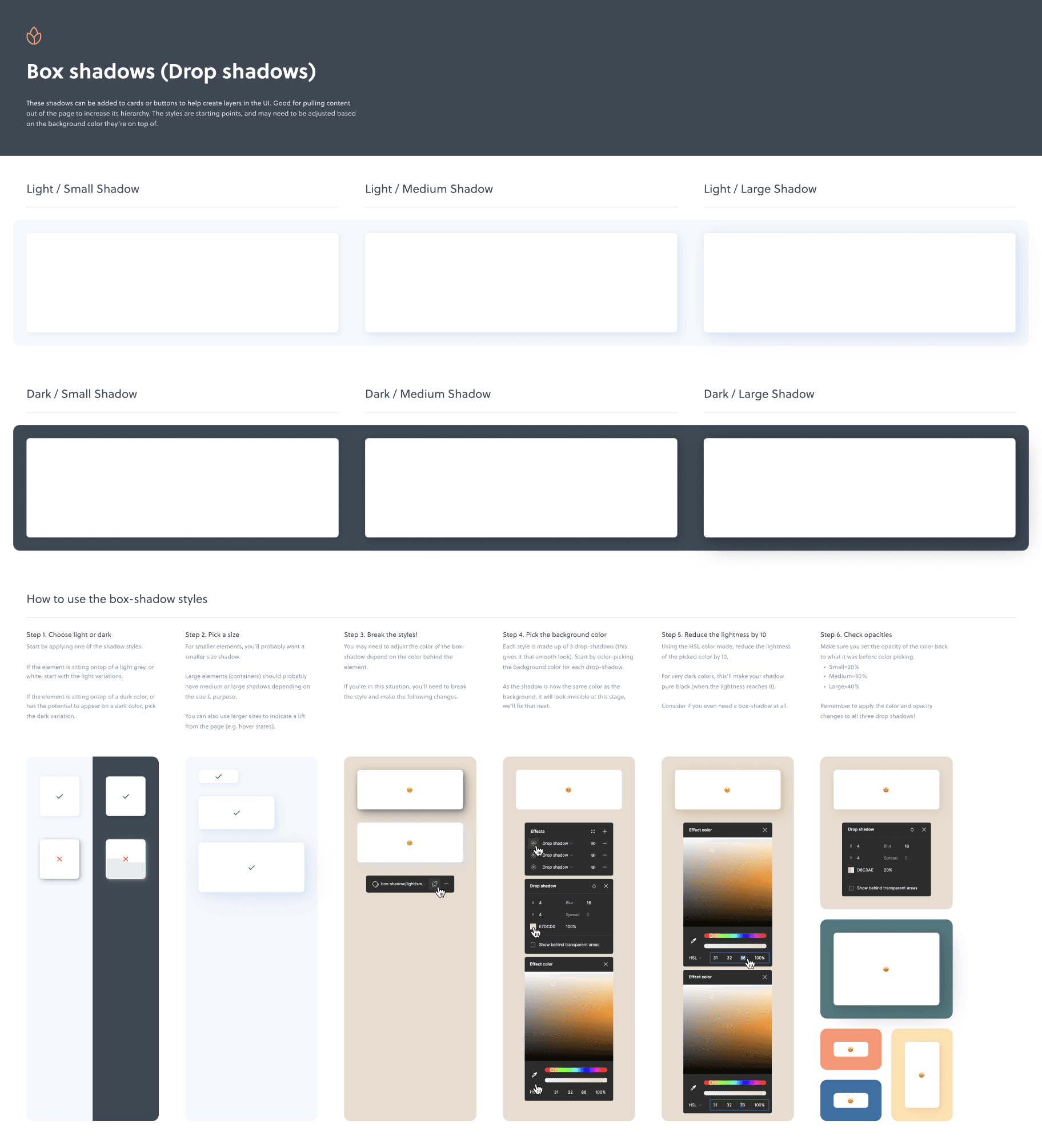
The existing colour palette lacked flexibility and, after auditing the platform, we found many inconsistent colour variations and insufficient contrast to meet WCAG 2.0 standards. We created a new palette, carefully testing each tint and shade across combinations to improve contrast and provide greater flexibility for UI components.
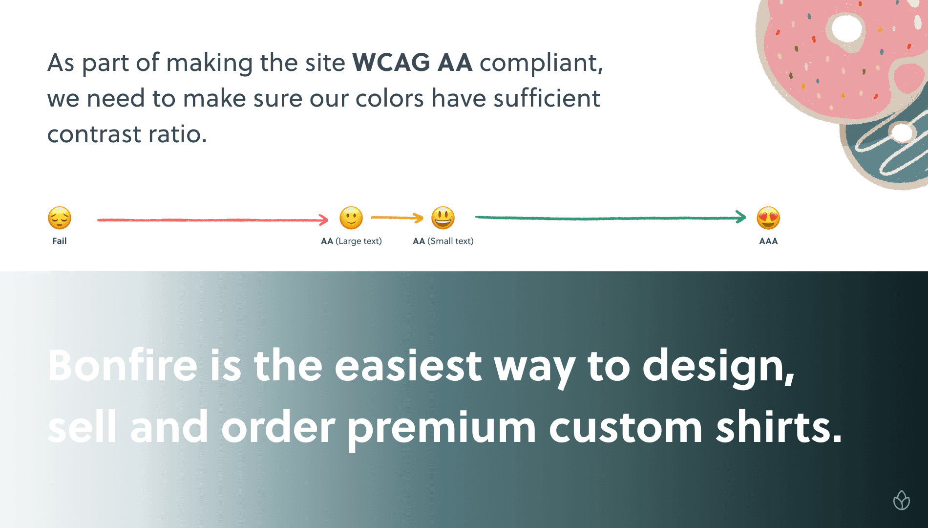
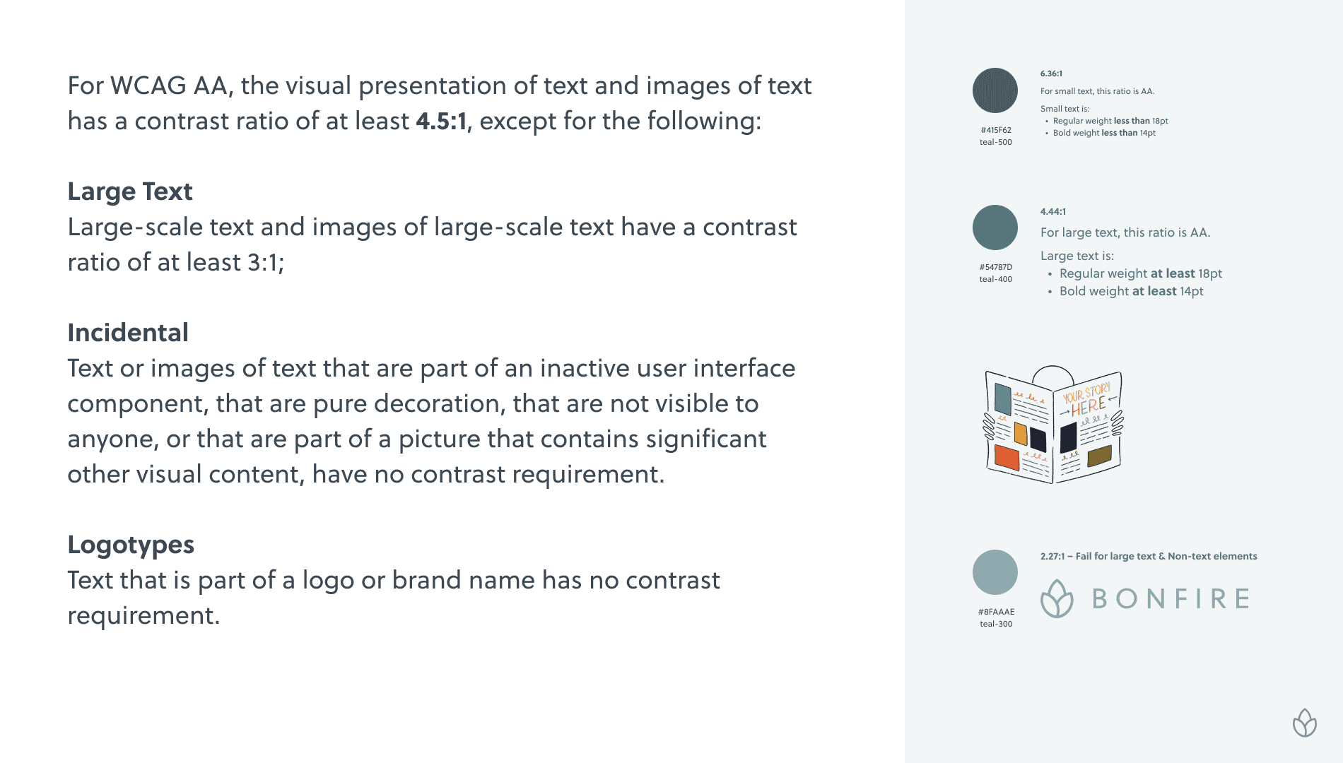
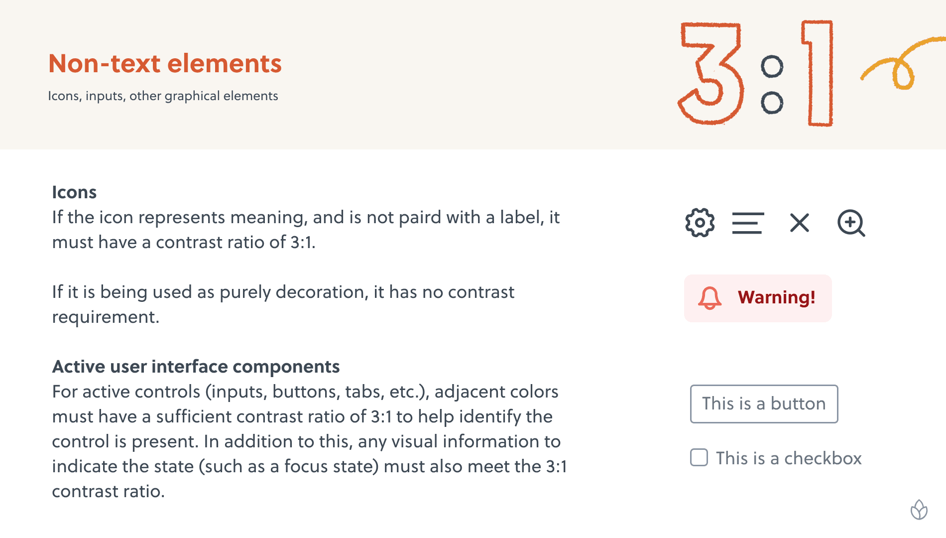
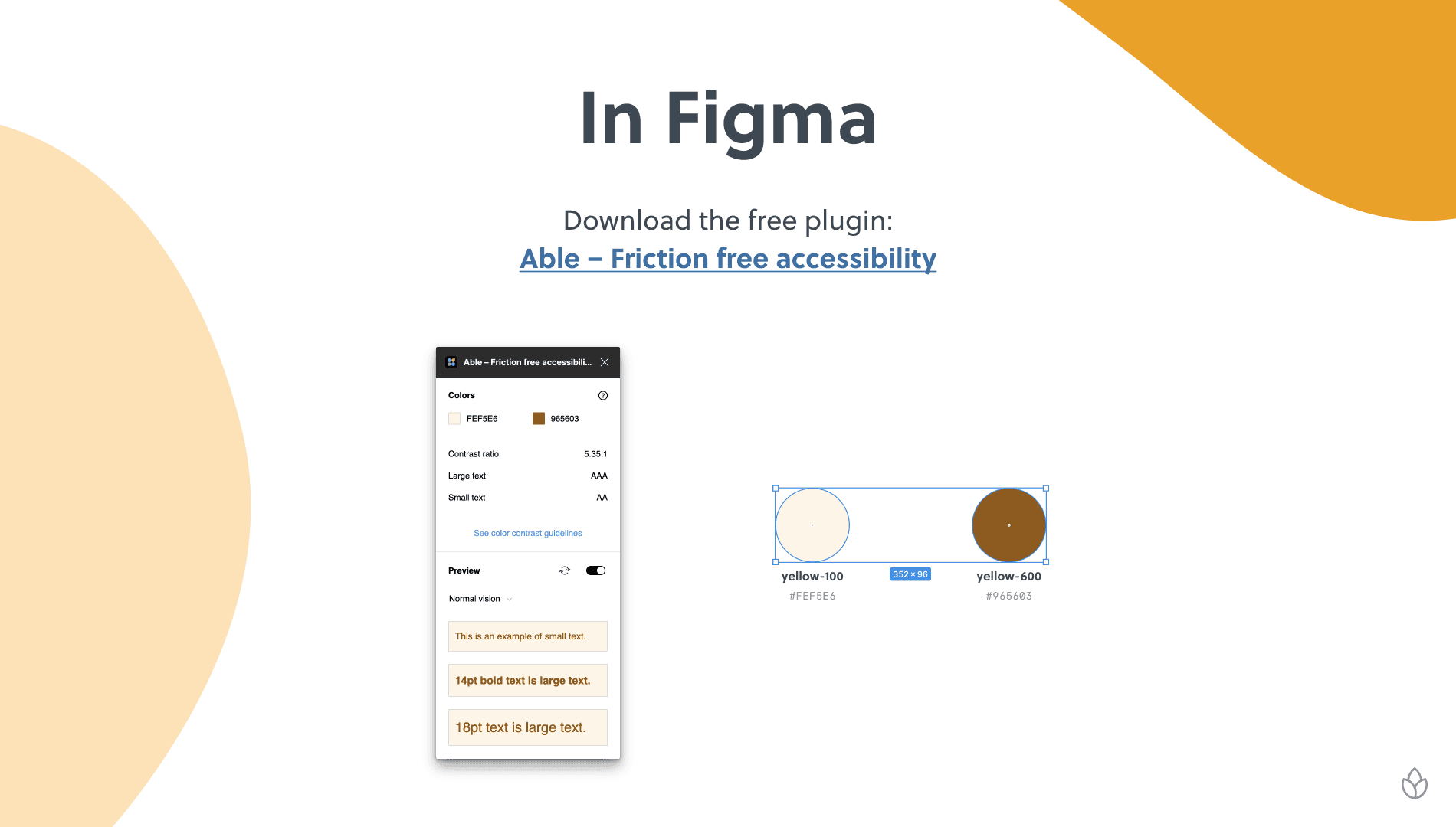
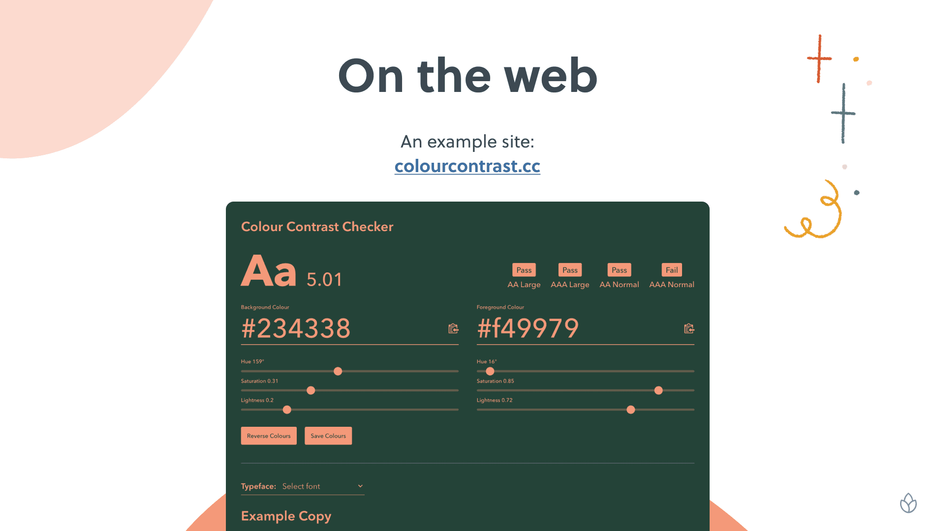
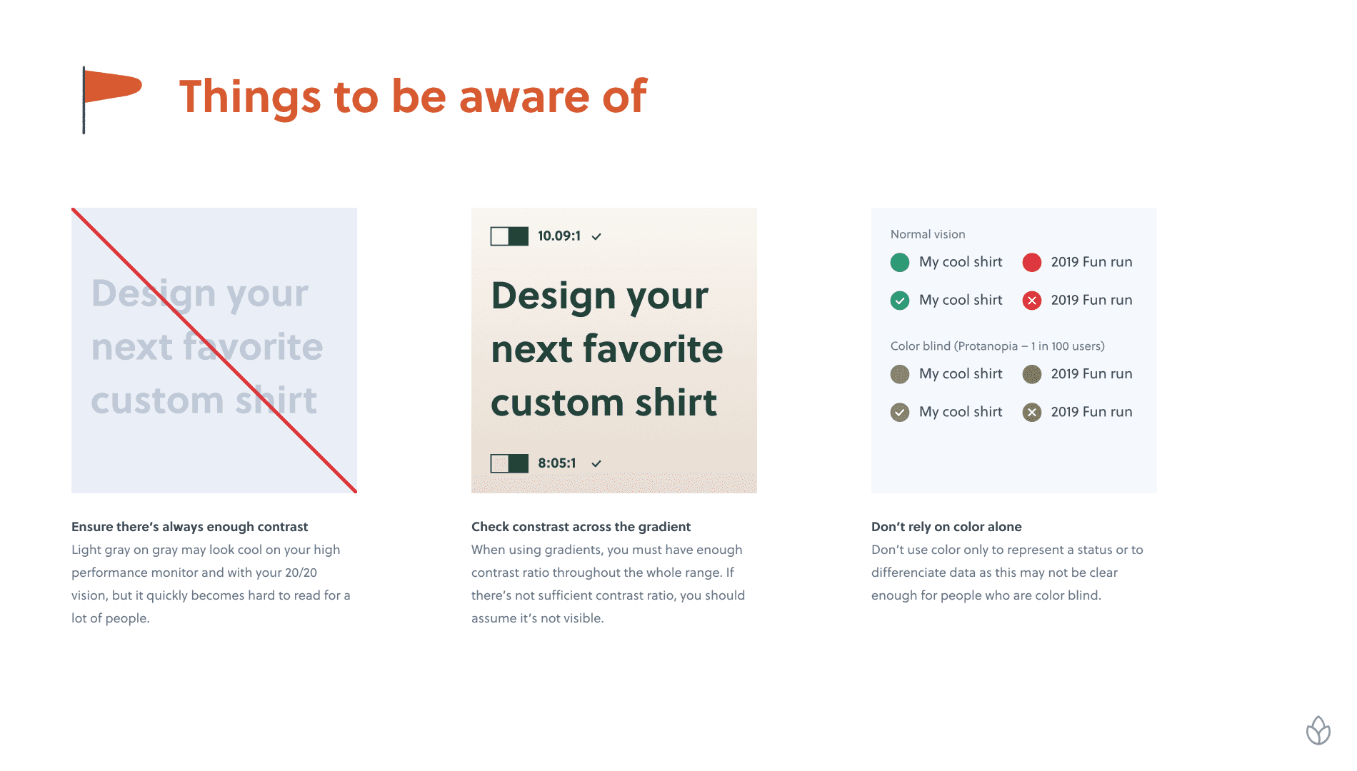
A presentation was made to help explain colour contrast to the rest of the team, explaining how to check the contrast, and things to watch out for.
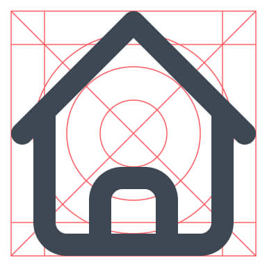
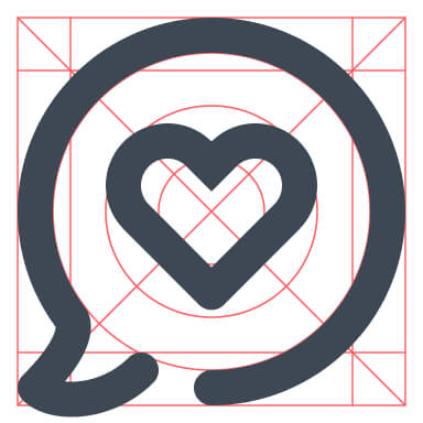
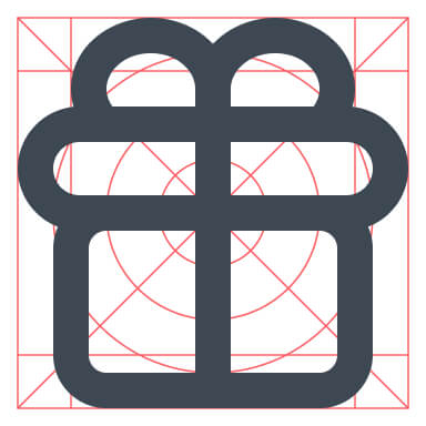
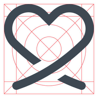
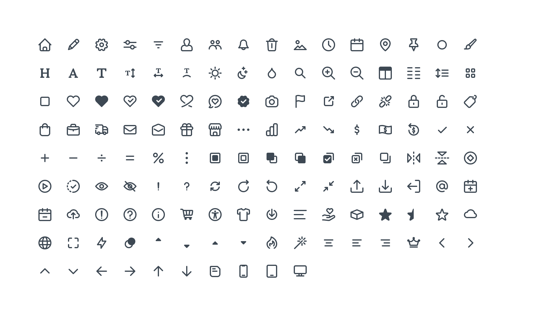
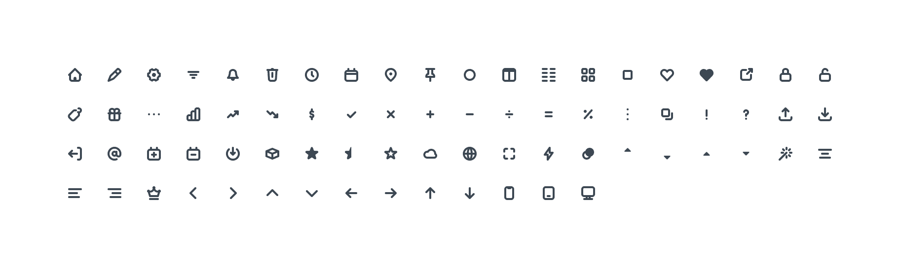
An updated, and expanded icon set
All the icons were re-drawn on a newly created icon grid. This helped improve the consistency of the icons. In addition to re-drawing the existing 24px icons, we created a few 16px icons to be used in places where the larger icons were too dominant.


Scalable typography
Like the colours, we wanted to create more flexible typography styles that could be applied to any piece of text. We opted for a Tailwind-like scale so we weren't stuck with pre-defined styles for each HTML tag (h1, h2, p, small, etc.)
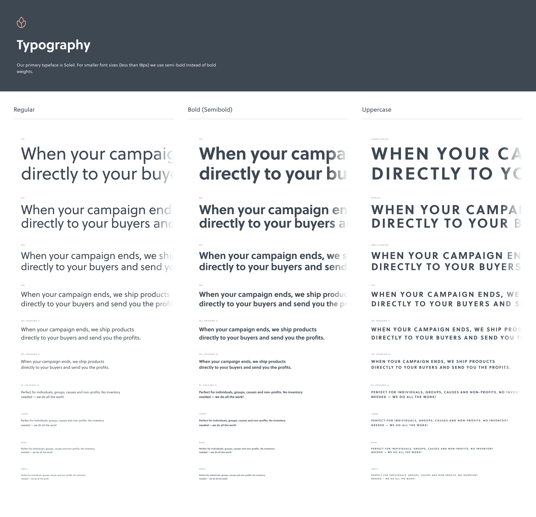
Utilising Figma's variables, we automatically reduced the sizes of some of the larger styles, making them more suitable for tablet and mobile.
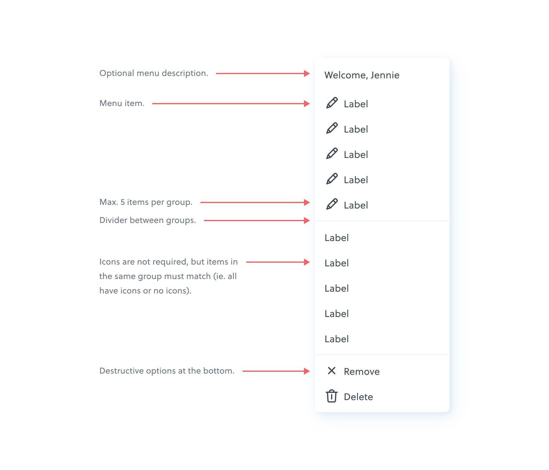
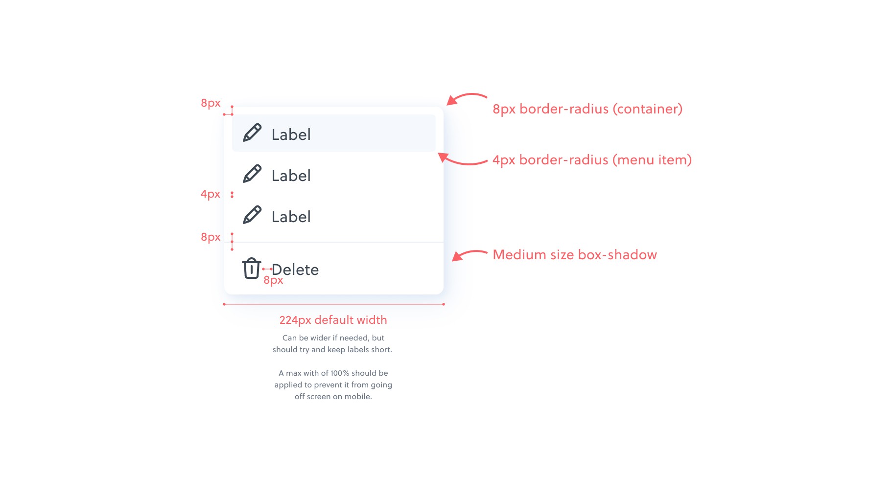
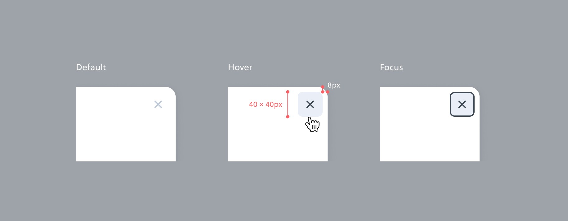
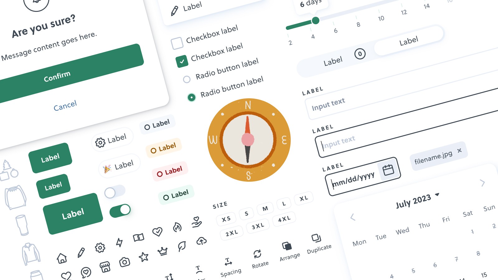
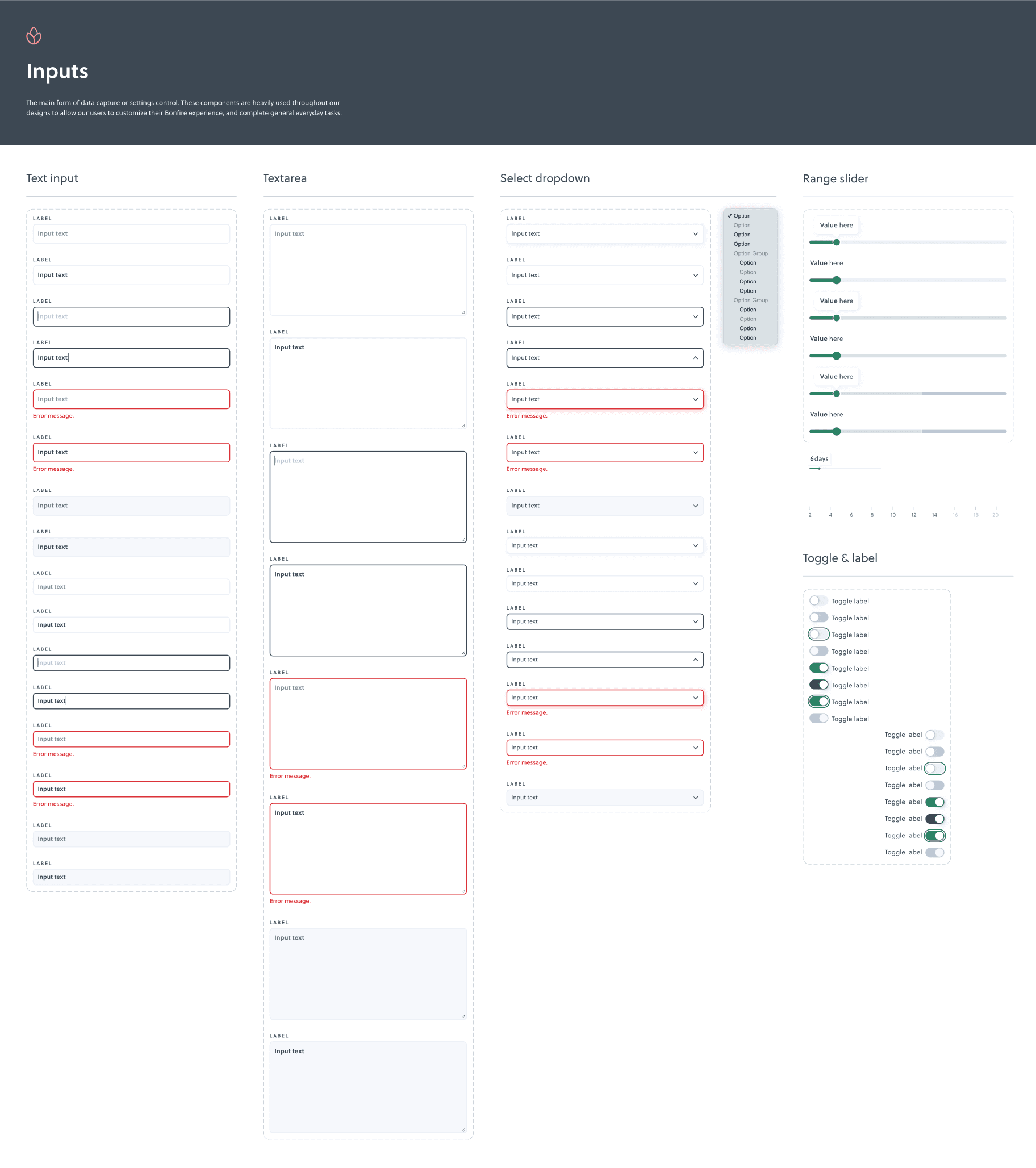
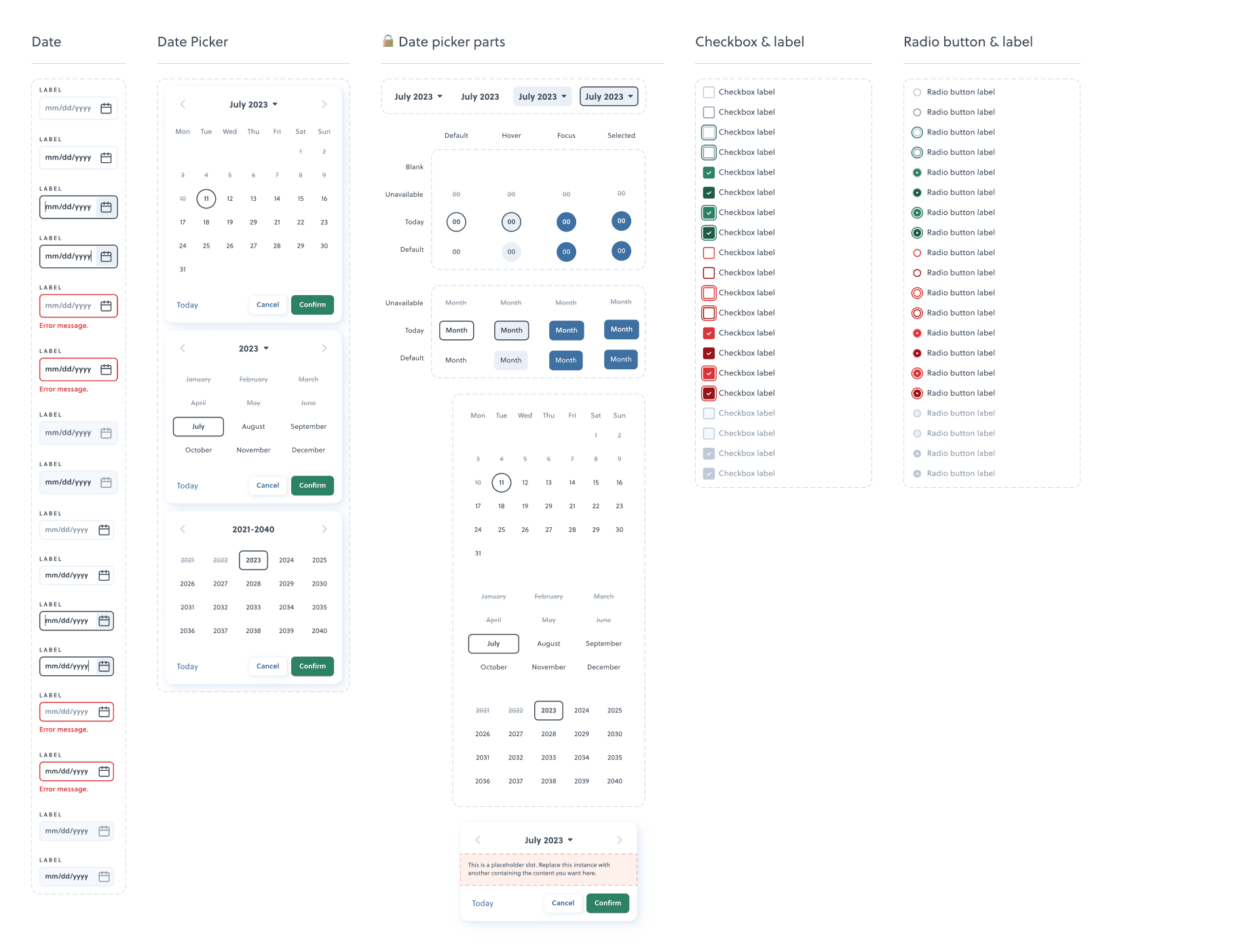
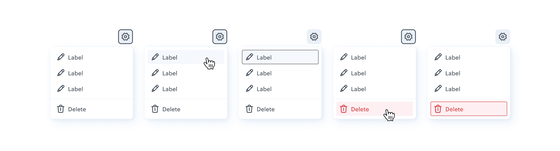
Interactive inputs
To help speed up the design process, all the input components were re-built using the new colours and typography styles, and also hooked up with some basic prototype interactivity.

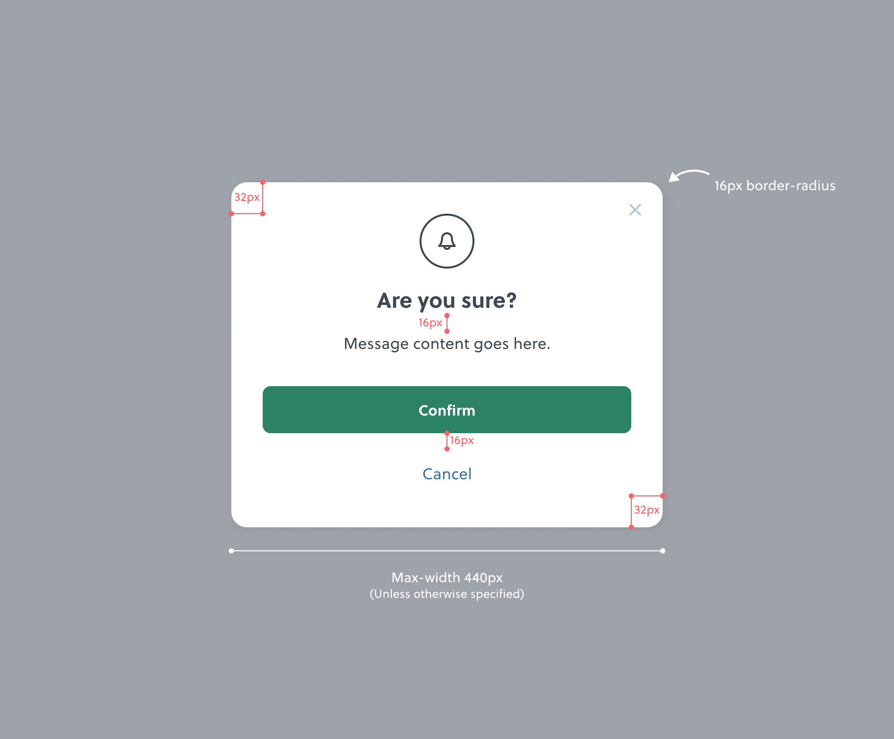
Documentation
Alongside the new components and styles, I wrote some helpful documentation to help with developer handoff, and also to help remind us how to use some of the more customisable components and styles.